
Google Keep is undergoing a visual transformation, bringing its Android widget design up to date with the latest Material You and Android design guidelines. This update, though not fully rolled out yet, signals Google’s continued push for consistency and modern UI experiences across its app ecosystem.

A More Modern, Spacious Design
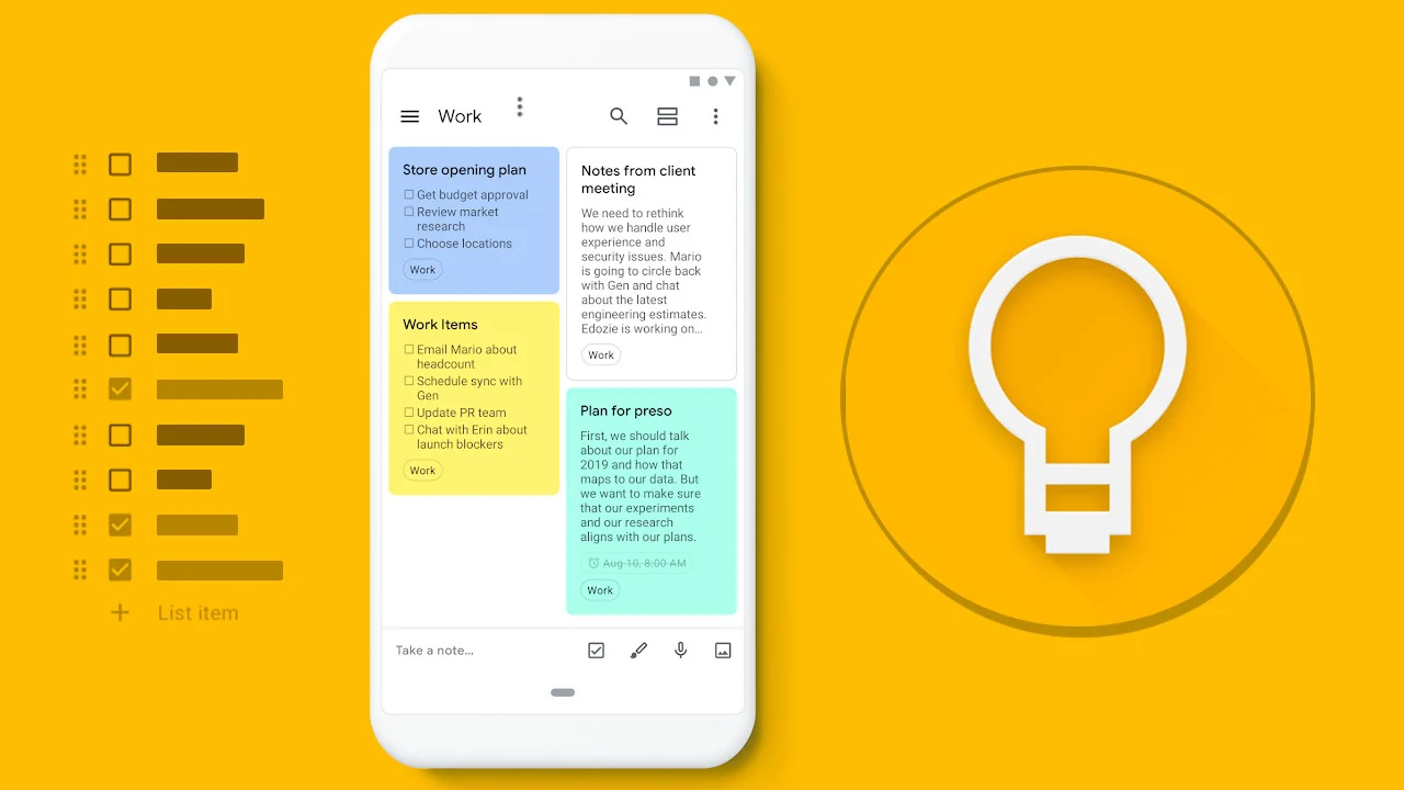
The current Google Keep widget, which hasn’t seen major updates since the initial Material You rollout in 2021, is getting a much-needed refresh. Previously, the “Quick Capture” widget featured a floating plus icon for creating a new text note inside a rounded square, while icons for creating lists, drawings, photos, and audio notes were simply overlaid on the background without containers.
The new design follows Google’s most recent Android widget best practices, taking up more vertical space while retaining the same width. This revised layout includes:
A vertical pill for the “+” new note action
Rounded rectangle containers for each of the secondary note functions like lists and drawings
A cleaner, more uniform look that aligns better with Material 3 (Material You)
This layout change reflects the “high-quality widget” guidelines Google outlined in March, emphasizing usability, touch targets, and aesthetic consistency.
Not Yet Fully Live
At the time of publishing, this redesigned widget appears only in the widget picker and during the brief animation when placing it on your homescreen. However, after placement, it reverts to the current design as of Google Keep version 5.25.122.00.90.
No changes have yet been implemented for the Note collections or Single note widgets, which had already received updates more recently.
Google Drive May Follow Suit
Interestingly, users may spot a similar design approach in Google Drive’s “Quick Actions” widget, which has also started appearing with new rounded UI elements in some cases. While not widely available, this may indicate a broader rollout of refreshed widget designs across Google’s productivity suite.
What It Means for Users
This update may seem incremental, but it reflects Google’s broader strategy to harmonize its user interface across Android, making experiences feel more cohesive and intuitive. For Google Keep users, this means easier access to note-taking tools, improved touch usability, and a visually consistent look across devices.
Bhupendra Singh Chundawat is a seasoned technology journalist with over 22 years of experience in the media industry. He specializes in covering the global technology landscape, with a deep focus on manufacturing trends and the geopolitical impact on tech companies. Currently serving as the Editor at Udaipur Kiran, his insights are shaped by decades of hands-on reporting and editorial leadership in the fast-evolving world of technology.